Transforming a fragmented 36-field checkout flow into an intelligent, mobile-first experience that drove $35M in incremental value
"Our users currently face a labyrinth of 36 input fields and fragmented flows trying to set an appointment."
Our car selling experiences had significant fallout gaps in the flow. The legacy one-size-fits-all in-store selling experience forced customers through long data entry fields and document uploads, causing massive drop-off rates.
How might we decrease the user's huge cognitive load due to overwhelming number of input fields?
How might we reduce burden on customers having to input things and help users feel like they're moving forward?
How might we improve visual feel and create a mobile-first design?
How might we triage customers into the right experience, the first time?
I organized and led a comprehensive field study in 6 of our CarMax stores in Dallas, Texas, to understand both customer and associate pain points. We wanted to understand express Drop-off adoption, but it quickly became the catalyst for a complete product rearchitecture. We conducted customer and associate interviews to see what they thought about the product and how it could be improved.
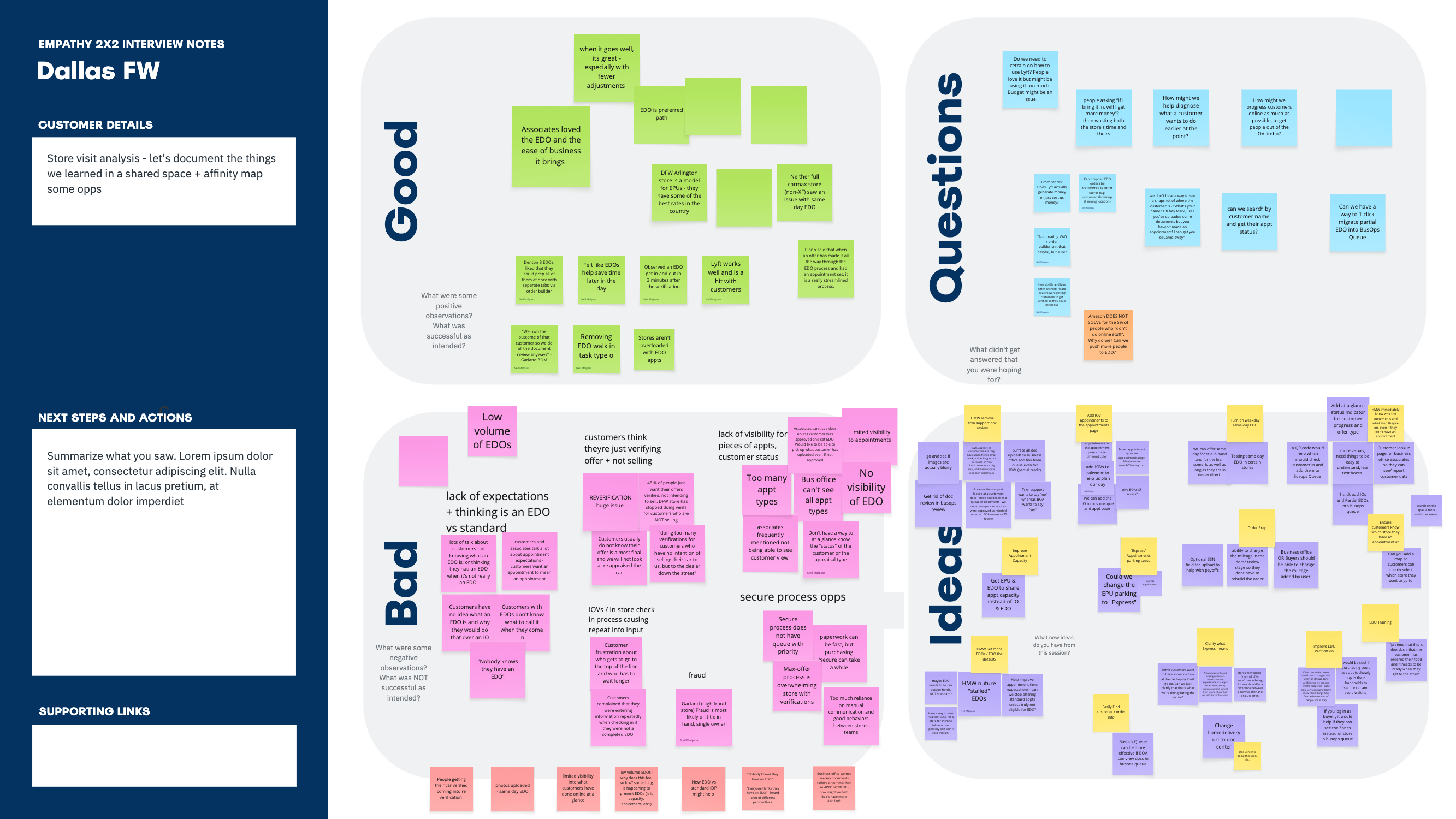
Dallas field research synthesis: categorizing customer and associate feedback into "Good," "Bad," and "Ideas" to identify friction points and opportunities across the entire selling journey
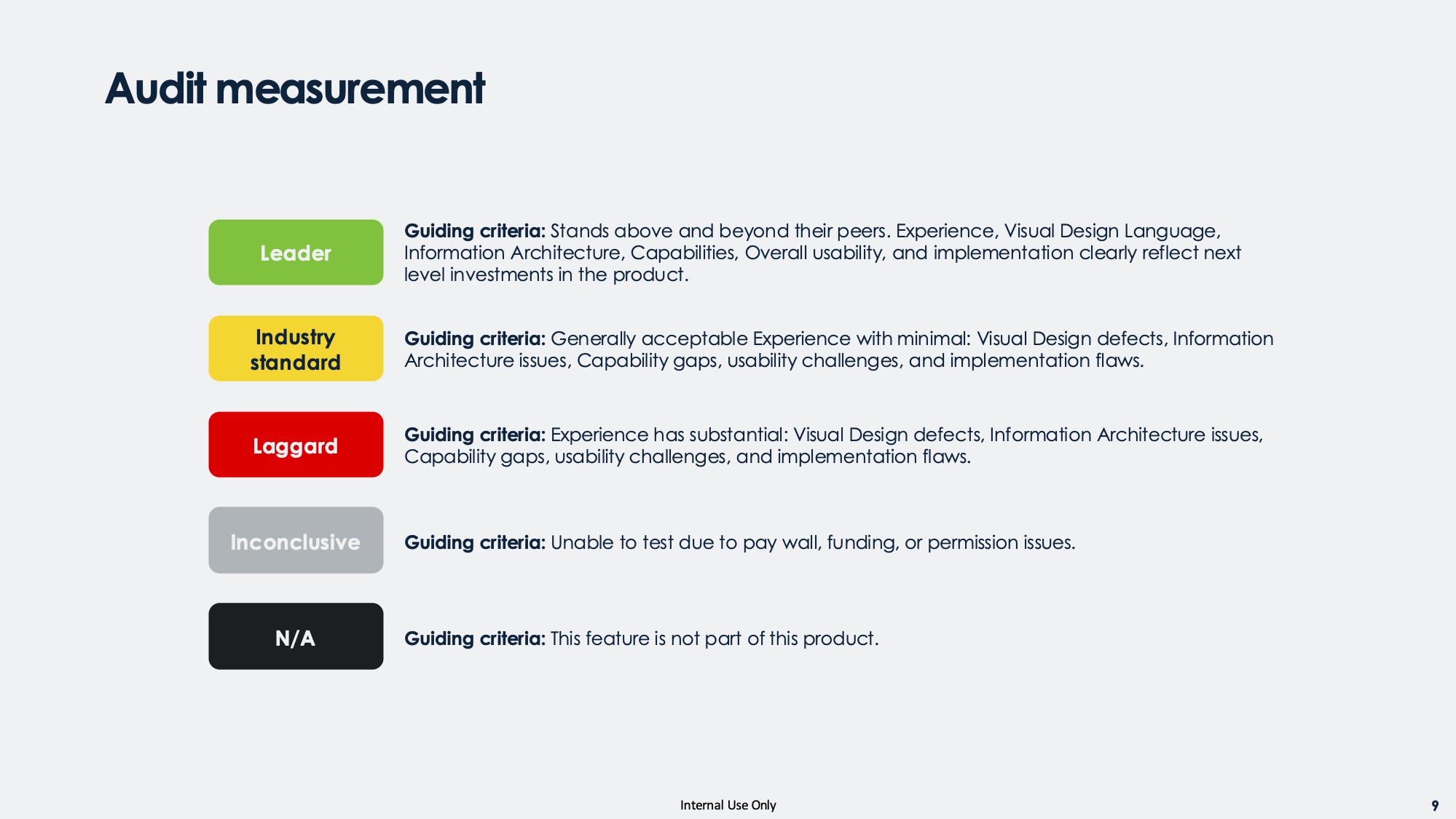
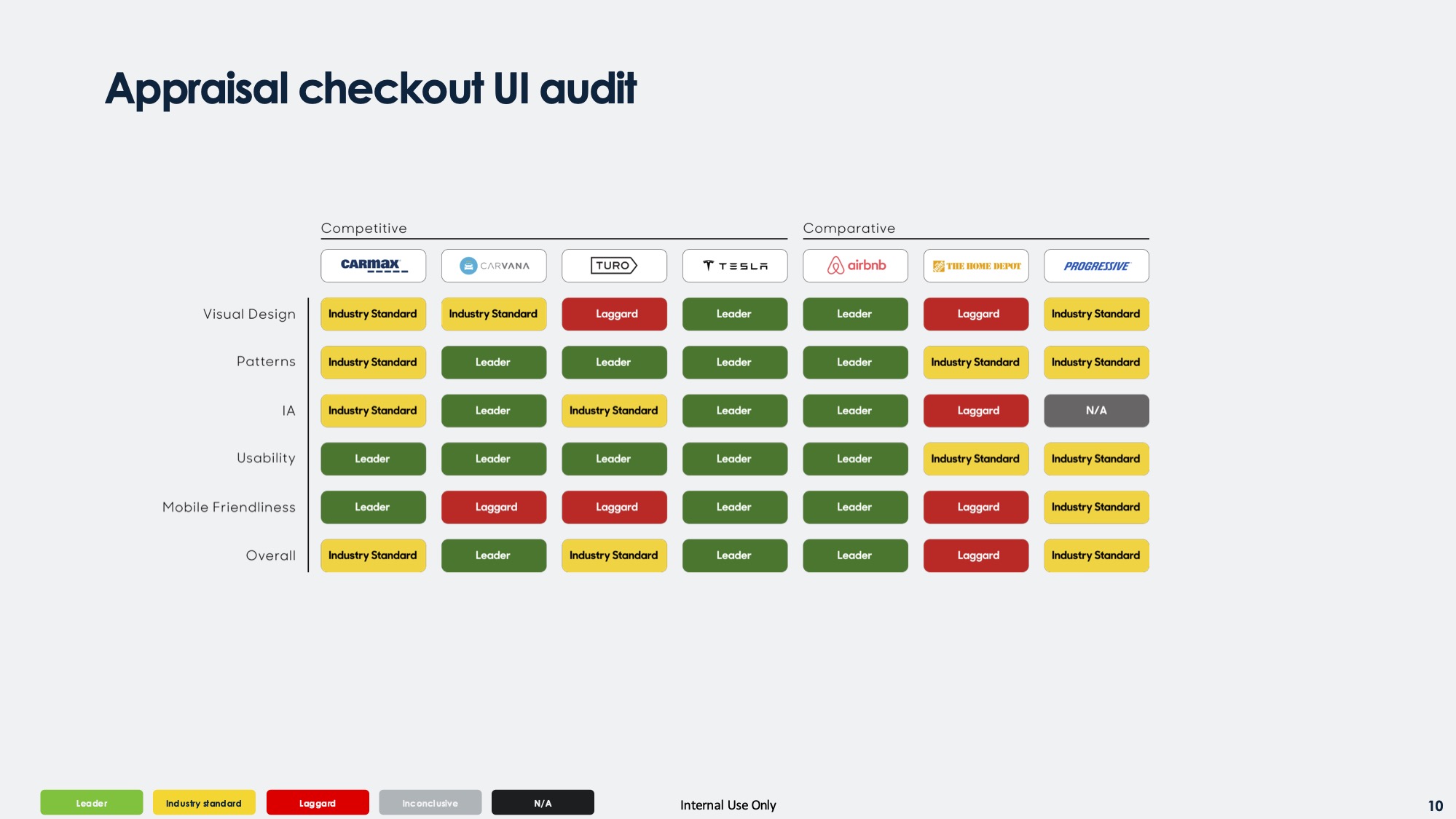
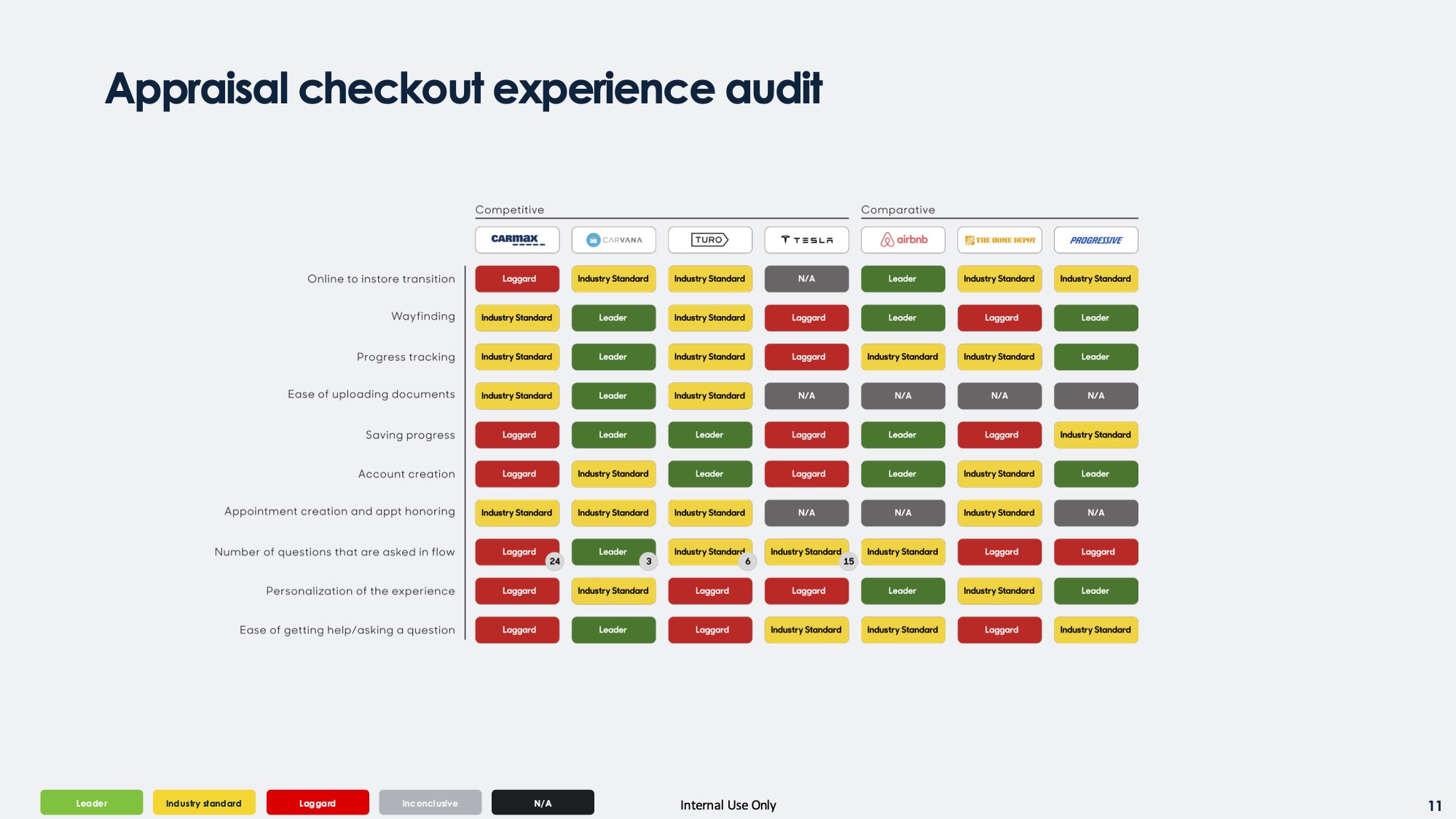
To understand the friction points and opportunities, I led a comprehensive research initiative spanning field studies, competitive analysis, design sprints, and user testing.
Organized and led a 2-day field study across 6 CarMax stores in Dallas, TX to observe both customer and associate pain points.
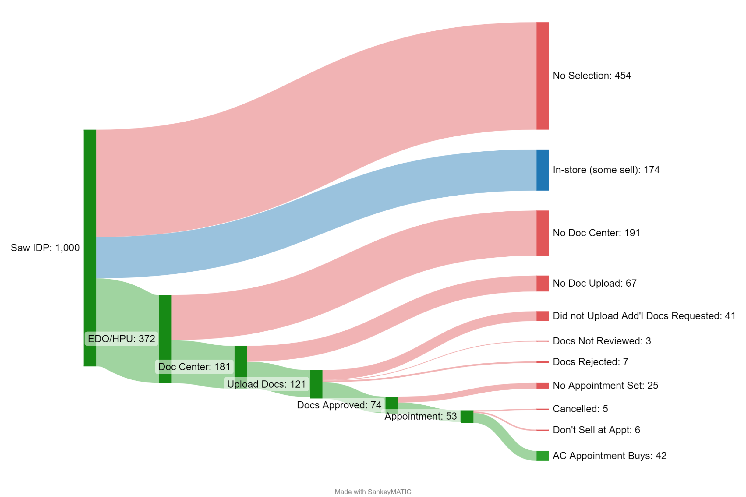
Analyzed 1,000 users who got to our decision page (and who didn't) to identify drop-off points and friction zones.
Conducted structured audit of 8 companies across automotive and adjacent industries, evaluating 40+ attributes.
Documentation from my audits of Carvana, CarMax, and several other tangential and aspirational companies
Click arrows to navigate through workshop documentation
Facilitated four workshops to align the team and generate solutions through collaborative ideation.
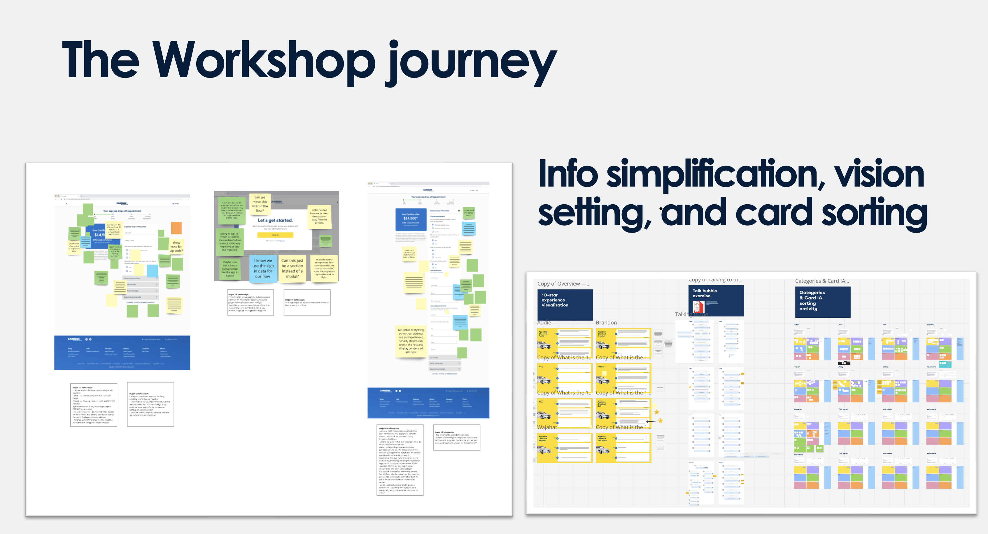
In order to remove complexity and bloat from our product, as well as get buy in from stakeholders, I ran a series of workshops that moved the team from complexity, to clarity to conviction.
Workshops are an integral part of my design process. They help us build alignment before building solutions, reduce downstream rework by addressing major tech fundamentals early, and create shared ownership across disciplines. The team loved it!
Reduce friction by questioning every data input
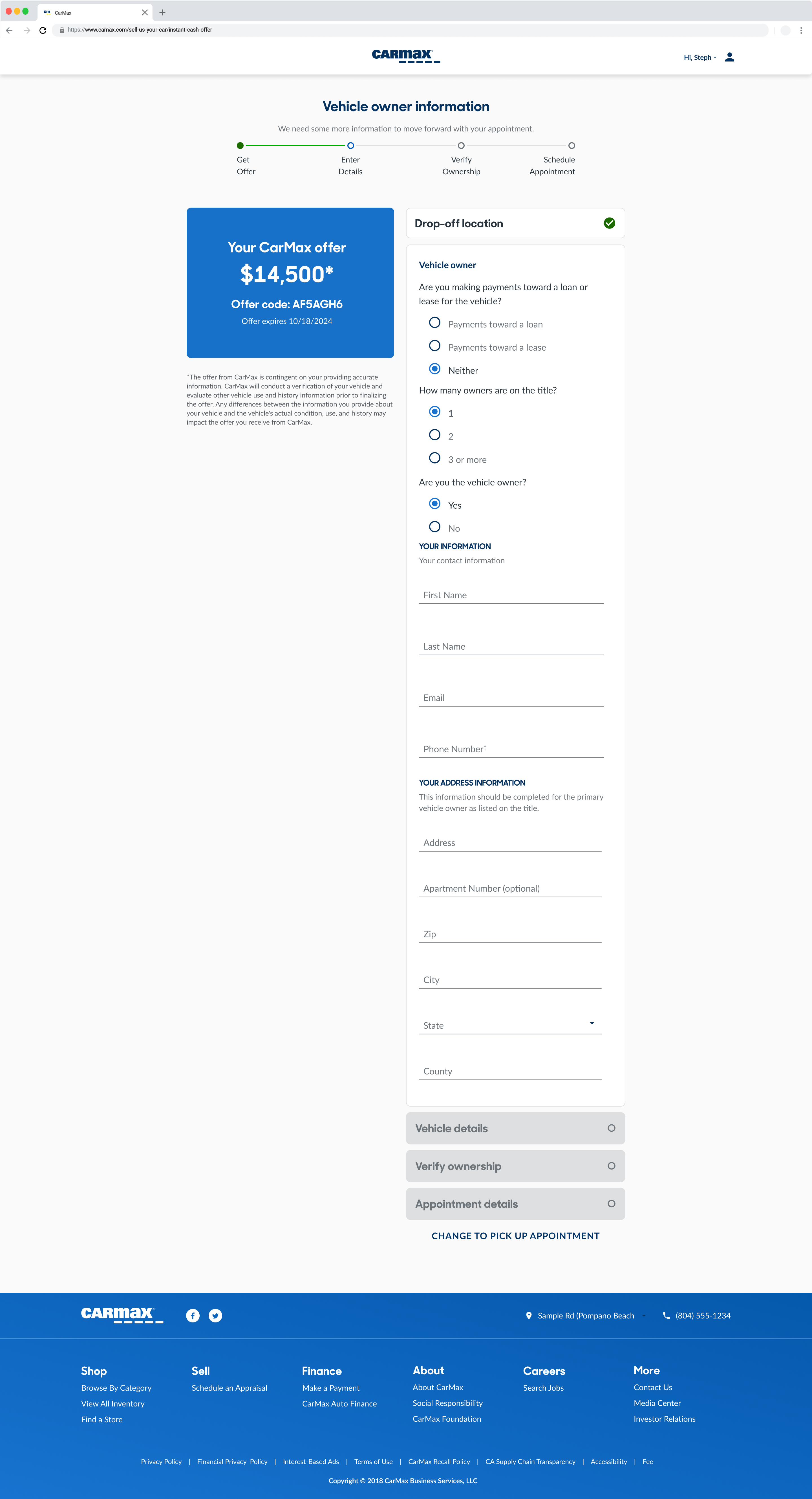
We audited the experience through the lens of cognitive load. With Product, Engineering, and stakeholders, we reviewed each screen asking: Does the customer truly need to provide this right now? Who uses this data downstream? What risk does this field mitigate, and at what cost to completion? By making the critique collective and visible, we identified clear opportunities to remove, defer, or combine inputs before we ever touched layout or flow.
Establish a flow that makes intuitive sense to customers
Once we knew what information was essential, we needed to decide where it belonged. We ran a structured card-sorting exercise to explore how customers might naturally group and sequence information. This helped us pressure-test assumptions about order and hierarchy, identify moments where the flow felt redundant, and reveal multiple viable structures rather than forcing a single "correct" answer too early.
Define a shared North Star before converging on solutions
Before converging on flows, we zoomed out. We asked the team to imagine what a 10-star CarMax experience would feel like—not constrained by current systems, risk tolerance, or legacy processes. This helped us separate "what's possible" from "what we're used to," align on emotional outcomes (not just functional steps), and create a North Star to evaluate future decisions against.
Humanize the interaction between customer and system
We treated the product like a conversation—what the system asks, how the customer interprets it, and how the system responds. This helped us identify where language felt transactional instead of supportive, surface opportunities to ask for information more naturally, and reduce ambiguity in key moments. It was a turning point in shifting the team from "form-filling" to guided, human-centered dialogue.
By the end of the series, we had: simplified required inputs, clear patterns for grouping and sequencing, a shared North Star for the experience, and a more human, conversational interaction model. From there, we synthesized the outputs into three distinct flows to prototype and test—each representing a different hypothesis about how we could balance simplicity, confidence, and operational needs.
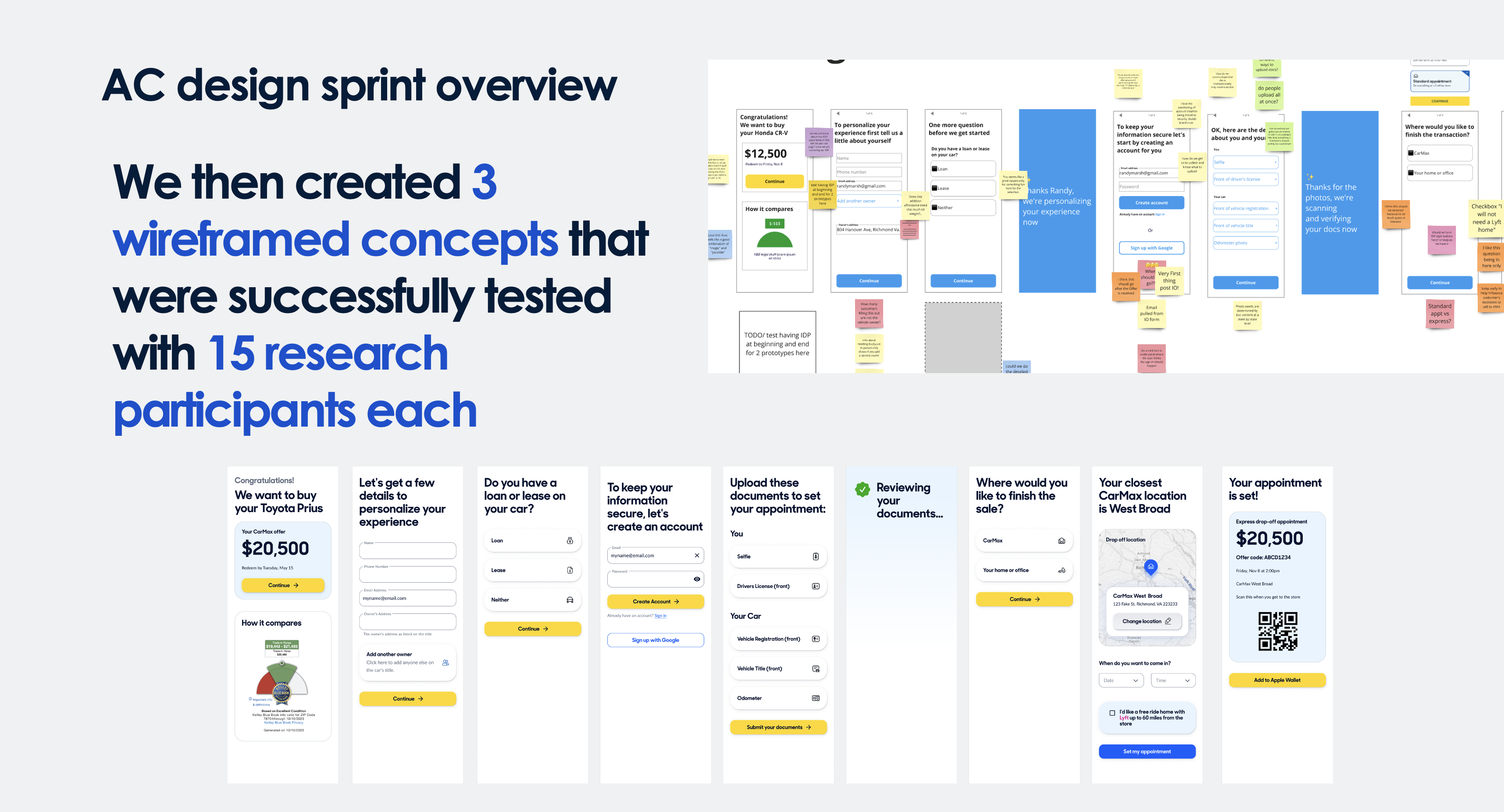
Collect only essential info upfront, push document uploads to after the offer
Hypothesis: Reducing initial friction increases completionBreak flow into clear stages with progress indicators, validate as you go
Hypothesis: Psychological momentum keeps users engagedPre-populate from existing data, use ML to auto-validate, only ask when necessary
Hypothesis: Showing progress toward automation builds trustAll of our 3 wireframed concepts, tested with 15 participants each across 5 rounds of UserTesting.com, performed significantly better than our old flow.
These results gave us high confidence in the overall direction, while also revealing which elements were driving the strongest outcomes.
Rather than picking a "winner," we analyzed why Flow 3 performed best, identified high-performing patterns across all three concepts, and synthesized them into a unified solution.
We tested all three flows with real customers to understand which approach resonated and why. Flow 3 (Smart Defaults) showed the strongest performance, but we noticed high-performing patterns in the other flows worth preserving.
Instead of shipping Flow 3 as-is, we:
This gave us an awesome solution greater than any of the flows by themselves.
We tested the combined flow in a follow-up round to confirm the improvements held up when unified:
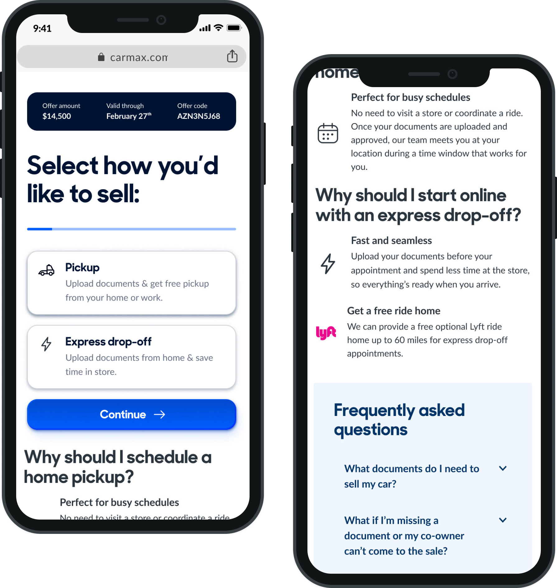
Simplified choice between Pickup and Express Drop-off with clear value props, mobile-first card design, and educational content about each option
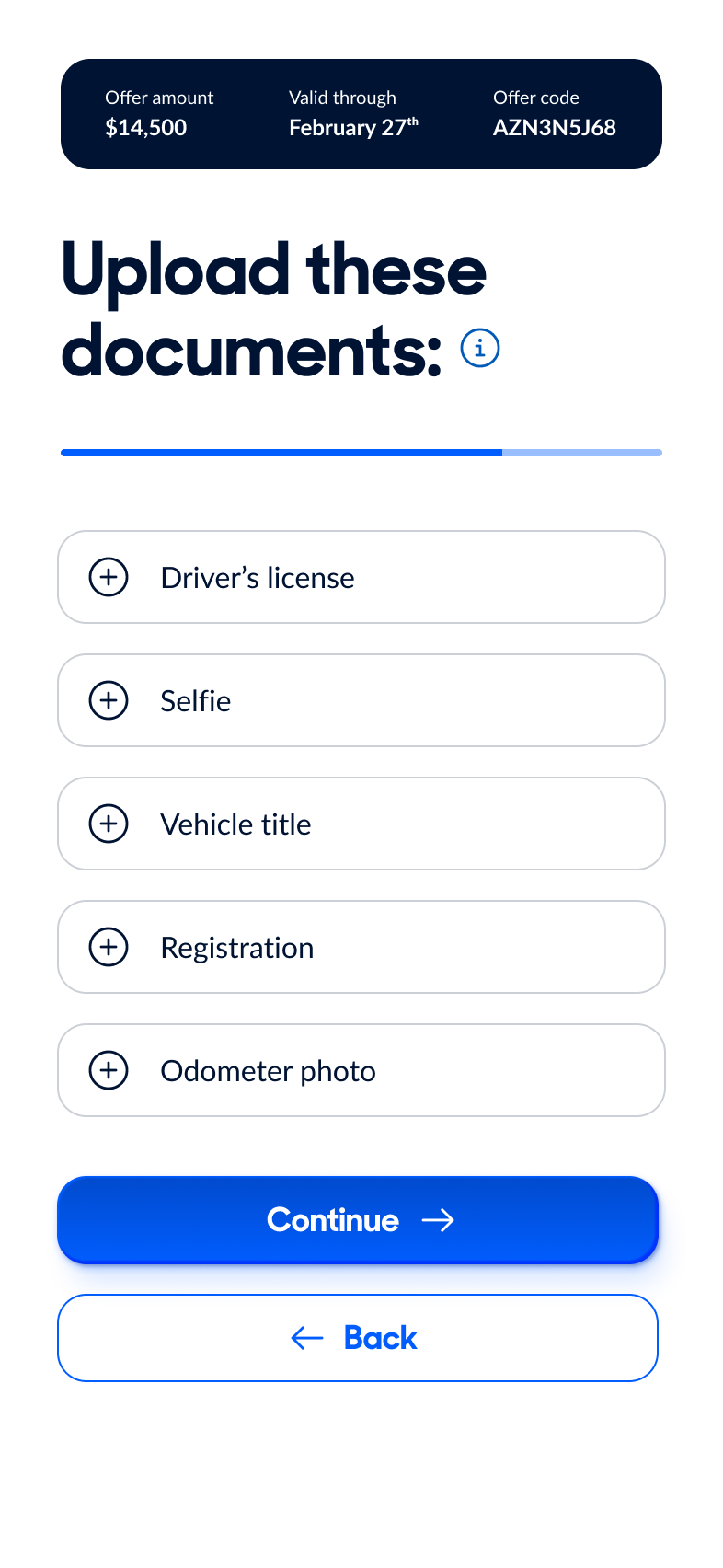
Mobile OptimizedCategorized checklist with progress tracking (50% completed bar). Made upload optional to reduce friction—customers can schedule first, upload later
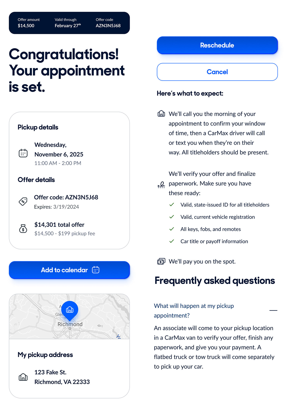
Progressive DisclosureClear pickup details with date/time, map integration showing location, calendar sync capability, and transparent expectations for what happens next
Trust BuildingRather than forcing all customers through identical steps, AC 2.0 identifies friction points in the journey and systematically removes them through intelligent design and adaptive routing.
Moved qualifying questions to the front of the flow with visual icon-based selection. Routes customers to the right experience before unnecessary data entry begins.
Lower Cognitive LoadOnly show fields relevant to user's context. Conditional logic hides irrelevant sections—lien payoff only appears if user has a loan, out-of-state process only if applicable.
Reduce Data EntryAuto-populated vehicle details from original appraisal, owner information from existing account, and nearest store location based on zip code.
Intelligent DefaultsRebuilt from mobile up with touch-friendly tap targets (44x44pt minimum), single-column layouts optimized for thumb zones, and bottom-anchored primary CTAs.
65% Mobile TrafficRemoved upload requirement as blocker to scheduling. Customers can upload now or later, with clear messaging: "You can start without all documents."
Remove BlockersEnabled same-day appointment setting before document review completion. Trust-based approach with clear preparation checklist after booking.
Reduced Friction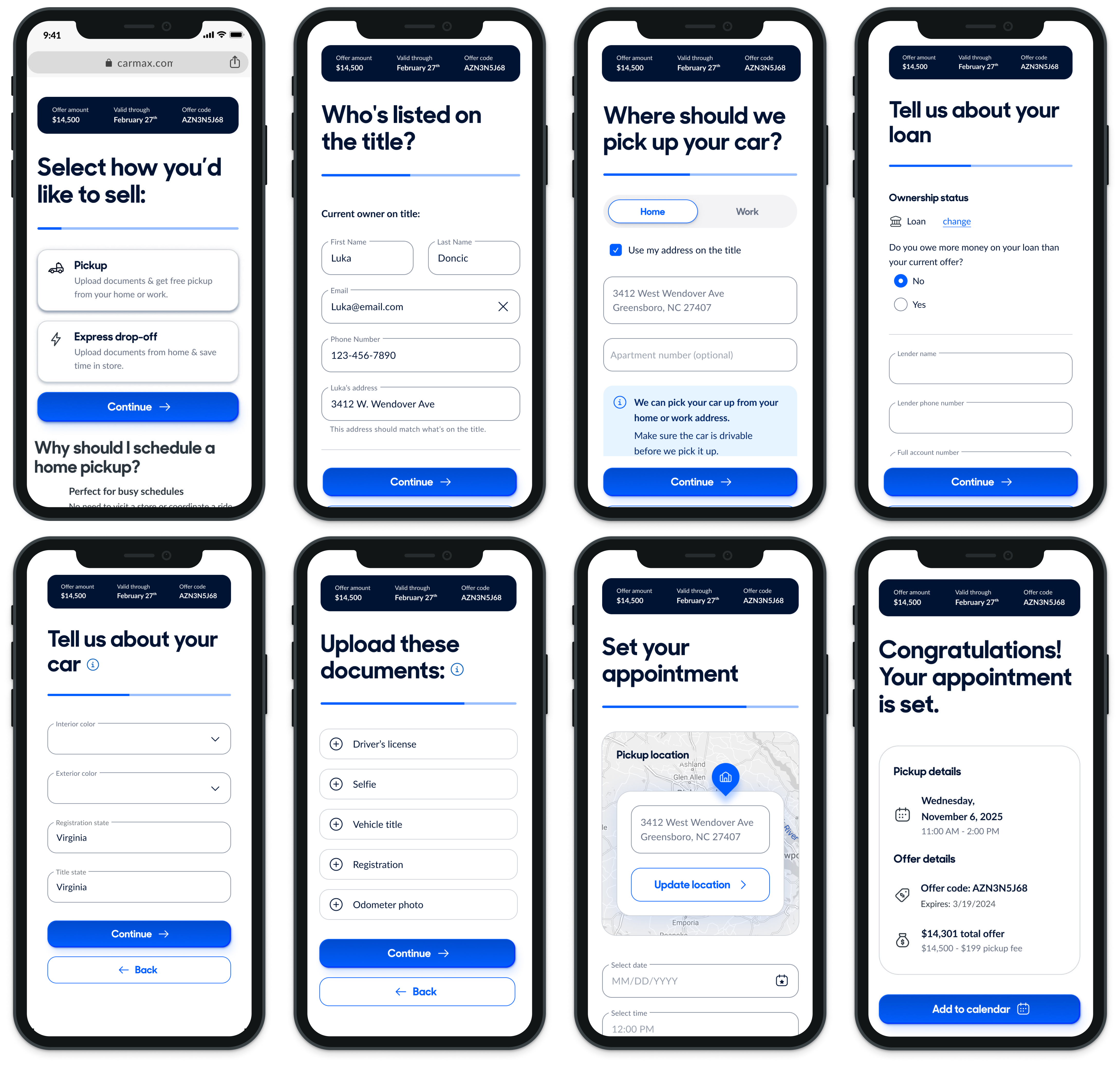
After validating the consolidated flow, we released to production in 3 phases in order to be able to test the redesign incrementally. We monitored performance against key business metrics. Simplification, smart defaults, and conversational guidance translated directly into measurable impact.
Clearer guidance increased confidence
The improvementscame from asking for less information up front, asking for it more intelligently when needed, respecting mobile constraints, and treating the experience as a guided conversation rather than a form.
This work moved from cross-functional discovery and alignment to comparative concept testing, iterative validation, then production release with measurable business results.
It demonstrates how intentional experience design can reduce friction, increase trust, and unlock meaningful growth at scale.
The Dallas store visits surfaced insights we couldn't find from interviews or survey results. "Customers don't know what they've signed up for" became our north star.
Testing in phases (purely design changes to logic changes) de-risked the redesign and built stakeholder confidence with progressive wins.
The "talk like a machine" exercise helped engineers see logic gaps in our eventing and flow design, leading to better technical solutions.
The +$35M incremental value validated that thoughtful UX improvements directly impact the bottom line.
Should have involved Learning & Development from discovery phase and designed training materials in parallel with product.
Partnering with ML team earlier to build automated document validation would have created even more efficiency gains.
The 19% doc upload increase from mobile users proved we should have prioritized mobile patterns from the start.